Last year, production designer Melinda Doring won the IF Award for Best Production Design for Australian-UK drama Oranges and Sunshine as well as an AACTA award for for her work on The Eye of the Storm. She tells fellow production designer John Rohde how she created the production design for Oranges and Sunshine while working on a tight budget.
John Rohde: How did you get involved with the film?
Melinda Doring: Oranges and Sunshine producer Emile Sherman (See Saw Films) suggested me to his UK co-producer Camilla Bray (Sixteen Films). I happened to be in the UK in the beginning of 2009 having just finished another UK -Australian co-production, The Boys Are Back, so I had the opportunity to meet with the director Jim Loach in London.
I loved Rona Munro’s script – it is based on the extraordinary autobiography Empty Cradles by Margaret Humphreys – so I found it easy to talk to Jim Loach about the project, something that was very close to his heart as he had been developing the script for the past seven years. My meeting with Jim Loach went well and when I returned back to Australia, found I had been offered the job. We had a few start dates but the film finally got the go ahead towards the end of 2009.
JR: What type of research did you have to do?
MD: I read Margaret’s book Empty Cradles to get as much information on real characters and locations that feature in the script. When a script is an adaptation from a book, it’s always great if you have time to read the original source material, as often little details may be left out that can help enrich the design process.
I initially did some internet research, looking for visual information on scripted locations such as Bindoon, The Fairbridge Farms and anything I could find on the Child Migrants Trust and the Child Migration Scheme. This led me to photographic archives of child migrants arriving in Australia and their lives in the institutions they were assigned to – the images of the child migrants building the real Bindoon Boys Town School in WA really affected me – to think that children built the imposing Catholic Institution in the middle of nowhere is mind boggling.
A month or two before our official pre-production was to start in Nottingham, Jim Loach came to Australia to start the initial search for some of the required locations in South Australia. He spent a week with the location manager Sarah Abbey and then I joined him for three days. This was a great thing to do early on as we got a real sense of what we would be contrasting our UK locations with, and it gave me another opportunity to understand what Jim wanted visually for the film. His main priority was that the film had a sense of period (1986-87), but that the period look didn’t distract from storytelling.
When I arrived in Nottingham, one of my first priorities was to do more research at a couple of the local libraries. I didn’t have a lot of time to do this but it really helped me get a sense of what Nottingham and the UK was like during the film's time frame. This was important for me to understand, as we wanted a visual contrast for the look of the UK elements of Margaret’s hometown and that of what she experienced when she came to Australia.
I looked for a mix of documentary style photographers from the time as well as anything that would give me style/character/period references that matched the worlds we aimed to recreate. I wanted the audience to experience the visual difference, to experience her journey and the contrasts she was facing as she made the trip back and forth, as she relates to the child migrants and what she must have experienced.
Martin Parr, a UK documentary style photographer, was a huge influence and inspiration to me in working out the visual feel of the film. He is known for his incredible images of the UK in the 1970s, 1980s and beyond – the images are not only great character studies, but they helped inspire ideas for developing the colour palette of the film. (His website if worth looking at: www.martinparr.com.)
JR: How did you communicate your concepts?
MD: As pre-production time was very limited, I created mood/colour palette boards from the research for the UK and Australia. We needed the colour palette to cohesively create the feel of the period (1986) something that both the sets and the costumes would follow. Costume designer Cappi Ireland and I collaborated on this palette and provided these ideas to cinematographer Denson Baker and Jim so we were all on the same page. I also compiled character/style reference files for the main locations to share with my key crew in both countries. When you are working with limited resources and time, having great references helps everyone in the art department communicate ideas quickly
JR: What was the balance of built setsand found locations?
MD: Most of the sets in the UK and Australia were locations that we adapted. In the majority of low budget productions that have large amounts of scripted locations, the budget really determines that finding good locations is a necessity, builds are not really an option, so locations are adapted to meet a character brief and meet period and stylistic requirements. On these types of productions locations can make our break you, so as a designer, you have to get very involved in choosing the right ones.
In the UK the main location was Margaret’s family home. If the production had more money it probably would have made sense to build some of the interiors as sets. But as this wasn’t an option we used two locations.
The exterior location was situated in a great street that gave you a real sense of the Nottingham landscape. This location was considered for the interior, but we all decided it was way too small to shoot all the scenes required, so we found a much larger location for the interiors. This house acted as our studio set – the rooms were little oversized which allowed better camera movement and provided better visual depth. We completely took over the place which was student house share: we relocated most of the tenants, emptied out their personal effects to repaint, changed the floor treatments, most of the electrical fittings, and all the interior dressings.
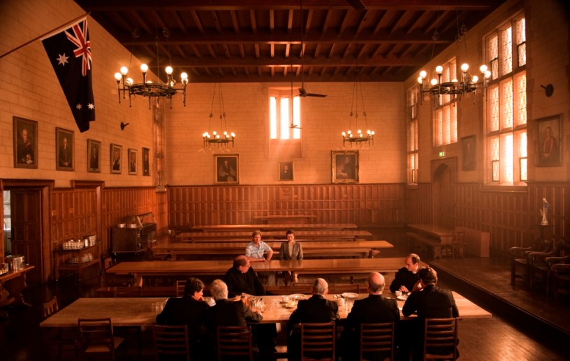
The biggest art department challenge in South Australia was possibly recreating the Western Australian catholic school Bindoon. This required blending up to six locations to give the audience the sense of scale and grandeur that this location needed to convey. We used three exterior locations: two were shot in the remote Flinders Ranges in a place called Arkaroola. This required several small builds including the gateway to the complex and several religious monuments.
The establisher of the main exterior building was another location in Adelaide. This required several elements to make it feel that it was situated in the same environment that had been established in Arkaroola. We matched the Arkaroola dirt to cover-up an existing concrete driveway and we added a large imposing religious statue in a garden bed and a partial façade that needed to blend into the traditional sandstone architecture and cover-up an existing contemporary glass entranceway.
This façade included a door that gave the characters an entrance point. A further three more interior locations were used to complete the journey required by the script. Six locations seems excessive but we needed to create a sense of awe at the scale of the Bindoon complex as it is so pivotal in terms of the story telling process, and we just couldn’t find one or two locations that really fitted the bill on their own.
JR: How big was your team?
MD: Both teams were very small. A bit too small but somehow we got through it. I had a separate art director in each country – the UK art director was a Nottingham local, Janey Levick, and my SA art director Tuesday Stone, but no art department coordinators.
Both Janey and Tuesday worked very hard putting together good teams. Both art departments were very resourceful, multitasking to get through the amount of locations and elements required. We had a slightly different balance of crew in both countries, due to the different needs of both shoots.
JR: How did you manage the international crew?
MD: Well as soon as I started discussions about the project with the producers I started the process of locking in my art directors, as the budgets for both art departments were to run as separate entities. The UK producer Camilla Bray introduced me to Janey Levick. Janey has worked as an art director and as a designer on many productions that have come out of Nottingham so she really understands the local industry. I interviewed her via Skype and really felt that we had a similar approach to how the project needed to be handled.
Janey put together a very tight team, most of who had worked together before, but I didn’t meet any of them until we were thrown into official pre-production, which was very fast and furious, so I had to put a lot of trust in her – she didn’t disappoint. Prior to leaving Australia I appointed art director Tuesday Stone to insure she could start the process of putting the South Australian team together so we could hit the ground running as soon I returned from the UK.
JR: Did they differ from Australian crew?
MD: Yes and no – It can be quite confusing at first. But as I had worked in the UK the year before on The Boys are Back I was prepared for it. The biggest difference is the way the art department is organised – roles have much the same titles, but the job descriptions vary slightly and many roles overlap. These subtle differences are too numerous to mention here but enough to create some initial confusion as to who is responsible for what.
One position that works so successfully within the UK system is the role of the standby art director. This has to be my favorite position that exists on productions big and small in the UK. It is a great stepping-stone career option for up-and-coming designers and art directors. They are the designer’s/art director’s eyes and ears on set. They work for you in that they control the way the art department elements transition onto set and make sure everything runs smoothly in front of camera. They supervise the standby props and work closely with the cinematographer and director and they often do pre as the art director's assistant.
I really wish we had this role in Australia. It allows the designer to feel that they can leave the set and know that everything will be alright. Standbys in Australia are amazing and keep their eyes on as much as possible but this role provides an extra set of eyes and allows the standby to focus on the continuity of the props while the standby art director concentrates on the frame. Art department coordinators only exist on large productions in the UK but this is because their role is spilt between varieties of other art department roles, so it balances out in a very different way.
The other curious difference is that art departments in the UK have the responsibility of providing grip construction services and blacking out requirements, which seems very odd at first, so it really makes you appreciate the role of grips within the Australian framework.
JR: Did you feel that you had enough resources at your disposal?
MD: To be honest, we had the bare minimum, so we had to be very creative to make sure we gave the film a consistent look. We had a great line producer who worked well with both my art directors and two wonderful creative art departments that were enthusiastic and skillful enough to work within the limitations. The other important element was that the entire core creative heads of department also understood the film's constraints. Everyone new that for the film to work we had to be good collaborators.
JR: What were the main challenges for the art department?
MD: A very short pre-production and short shoot in both countries, which meant decisions had to be made quickly, and the film's budget was pretty tight. So making sure that the resources of the art department budget were distributed appropriately. The art departments in both countries need to be flexible and multi task – we had lots of locations to deal with in both countries which meant continuous striking and dressing. In the UK, this meant that my crew work extraordinary hours to get the work done on time, particularly getting the main location ready for the shoot when we had limited access to the location.
In Australia, the main challenge was that we didn’t have the resources that are available for a period film that are available in the UK. In the UK there are props stores with period graphics packaging, furniture, props and dressing. Not to say that everything is sourced from these stores, especially on a low budget production such as this, but they are there when needed. Another huge benefit was that the Nottingham production office had an on-site vehicle co-coordinator who had a selection of '80s vehicles we could choose from, which meant we didn’t have to spend time sourcing all our vehicles. In SA there are no props stores or vehicle coordinators with a ready-to-go stock of period vehicles, so everything had to be sourced from scratch.
JR: What did you get out of the experience?
MD: The project had a great heart because of the subject matter; I felt privileged to be part of the story-telling process.
I loved working with Jim Loach the director, he was so easy to work with, very trusting but also very decisive when required. This was his first feature but he had such a vast experience as a TV director he really new how to get the most out of the challenges the production faced and provided a great on-set vibe among the crew.
Having another opportunity to work in the UK was really great especially as Nottingham and the scale of this production offered such different challenges to the ones I faced on The Boys are Back (which was based out of London and with a much healthier budget), so I feel I have had a taste of two very different ways of working there.
For more information about production design, visit the Australian Production Design Guild here.