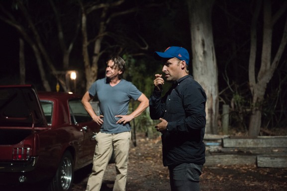
'Indigo Lake' is an Aussie neo-noir written and directed by Martin Simpson, produced by Brian Cobb and starring Andrew Cutcliffe, Miranda O’Hare, Marin Mimica and Pamela Shaw. Cutcliffe ('Home and Away', 'Wonderland') plays Jack, a painter who falls in love with his subject (Miranda O’Hare), to the chagrin of her gangster husband (Marin Mimica).
Simpson wrote the script in 2011 and brought it to Cobb, who put the budget together via private investors and the Offset. Beyond’s Martin Fabinyi, with whom Cobb worked under a Screen Australia Enterprise attachment, is executive producing. The indie feature made its world premiere in Canberra, the producer’s hometown, on April 23, followed by a screening at Sydney’s Dendy Newtown on April 26, where the stars, director and producer participated in a Q&A session.
International rights are being handled by KSM, and the filmmakers will head to Cannes in a couple of weeks, where 'Indigo Lake' is screening in the Marché. IF spoke to the film’s cinematographer, Rodrigo Vidal Dawson ('Observance', 'Skin Deep') about his approach to the film’s look and the challenges of ‘sunny noir’.
What did you shoot Indigo Lake on?
I shot on an ARRI package consisting of an Alexa and an Alexa MINI with a complement of Zeiss Master Primes and Zooms. All equipment was supplied by Video Australia Hire Sydney at Fox Studios.
What was your approach to the look of the film?
We wanted to pay homage to the look and feel of noir films from the 40s and 50s like Double Indemnity and Kiss Me Deadly. And also play with the colour saturation and contrast of 80s thrillers like Brian de Palma’s Body Double and Blow Out – but with our own Australian touch. In pre I sat down with production designer Jamie Craney and discussed the overall colour palette for the film, and Jamie and I wanted to be as precise as possible with colour hue and saturation levels, especially considering that ‘Indigo’ and ‘Lake’ were such important terms in the film for Martin [Simpson], the director.
How did you communicate what you were going for to HODs?
Jamie created a colour swatch that every department could use as a starting point. We all discussed the colour schemes, contrast and saturation of 1980s Australian pop culture. From the paintings of Brett Whiteley to the songwriting of James Reyne and Australian Crawl to the colour advertising of old Winfield Blue advertising posters.
A lot of the film is set at night. Did that make Jack’s studio and other interiors challenging to shoot?
Jamie and I spoke about giving specific importance to certain colours at different times of the day. For example we wanted Jack’s studio to be hot and bright; to feel like there was a lot of space to breathe. And then when it was night we wanted the shaft of colour coming from the exterior windows to make the same room feel almost claustrophobic. We wanted some of the textures to feel almost hyper real during the day and then a touch off at night. We were always going to play heavily with the contrast and push the shadow areas in the grade, so Jamie made sure that certain textures, in particular the set walls, had been saturated and had reflective finishes.
Was it tough going for that noir aesthetic with Australia's harsh light?
The gaffer Grahame Dickson and I decided to embrace it as opposed to trying to control it. It was the beginning of summer. We borrowed a few ideas from theatrical lighting – using unconventional gel packs on either the key or fill lighting. And we incorporated environmental aspects into the lighting; making our key light flicker to subtly play on the emotional state of certain scenes, giving a slightly theatrical feel to the lighting.
Was that a risk on a film that’s set in the real world?
Sure, but it is noir, and it was exciting to use a variety of gel packs that normally I wouldn’t use. We incorporated a lot of hard sources both day and night, only diffusing for certain close ups. I really enjoyed pushing the highlights around the set as well as the edge of the frame. We used gel packs that would really play with the transmission of the light source, as well as how it would be absorbed by the skin tone. Even if it looked a bit unnatural I would place hints of colour in highlights, backlighting characters or washing walls to add to the slightly noir world we were in. And then I would grade the saturation and hue point up or down to balance out with the emotional tone that Martin wanted for the scene.
* This interview has been edited and condensed.